Pride Illustrations | 2021 | Typography, Illustration
I have always had a special place for typography and bold colors. Hence, I took the chance while creating these banner illustrations for the Pride blog written by one of the content writers, while I was working at Sparklin.
The fonts used throughout are Quartro, Poppins, and Apple Chancery. They have a certain character that fits perfectly while we talk about how Pride is a movement about claiming back one’s humanity.
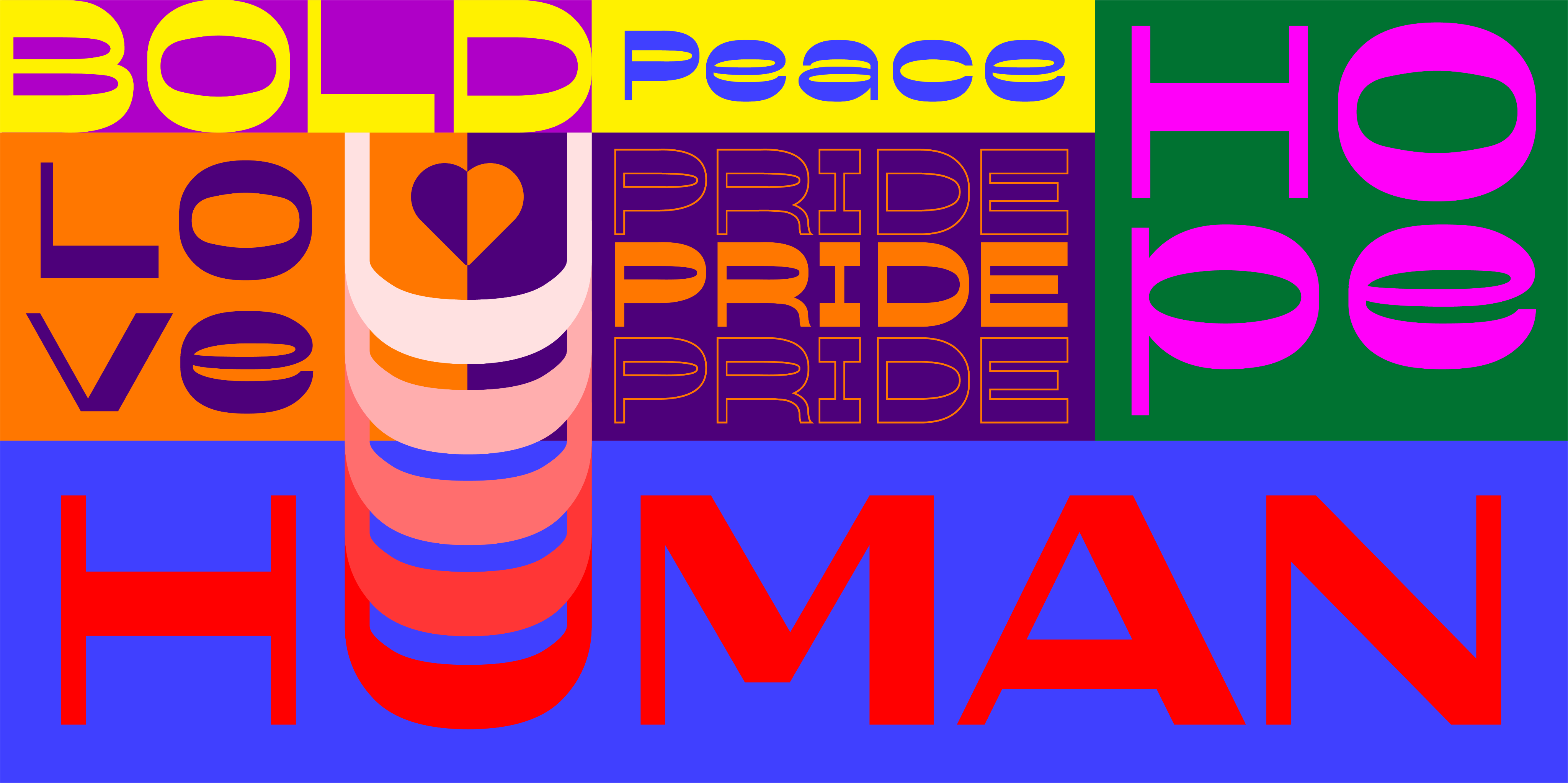
The banner image below represents what Pride is about and no matter who we love, in the end, we are all humans.
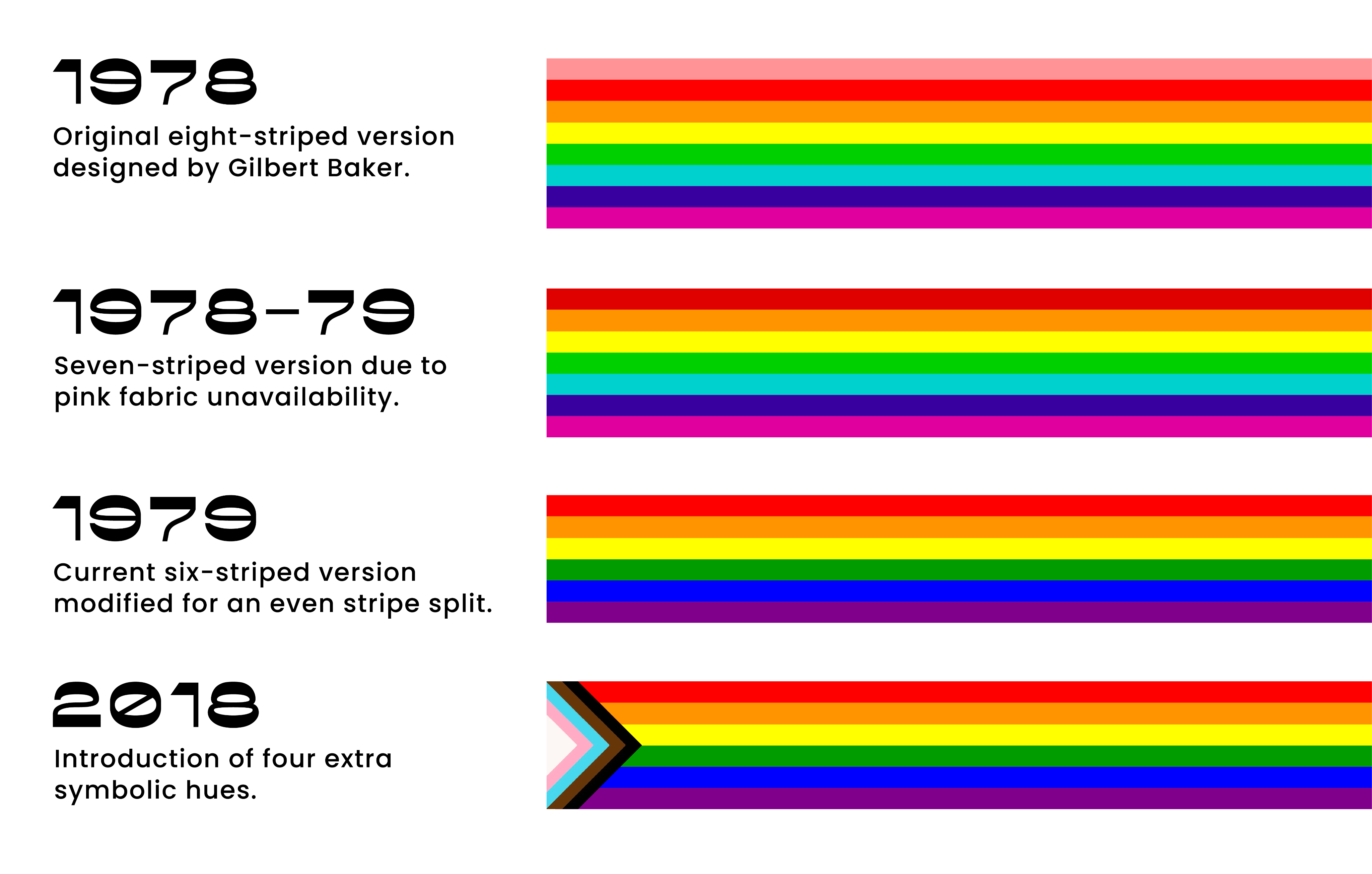
The graphic below talks about the evolution of the Pride flag until 2021.
The graphic shows the primary colors of the flag with the intention that there is no end to allyship.
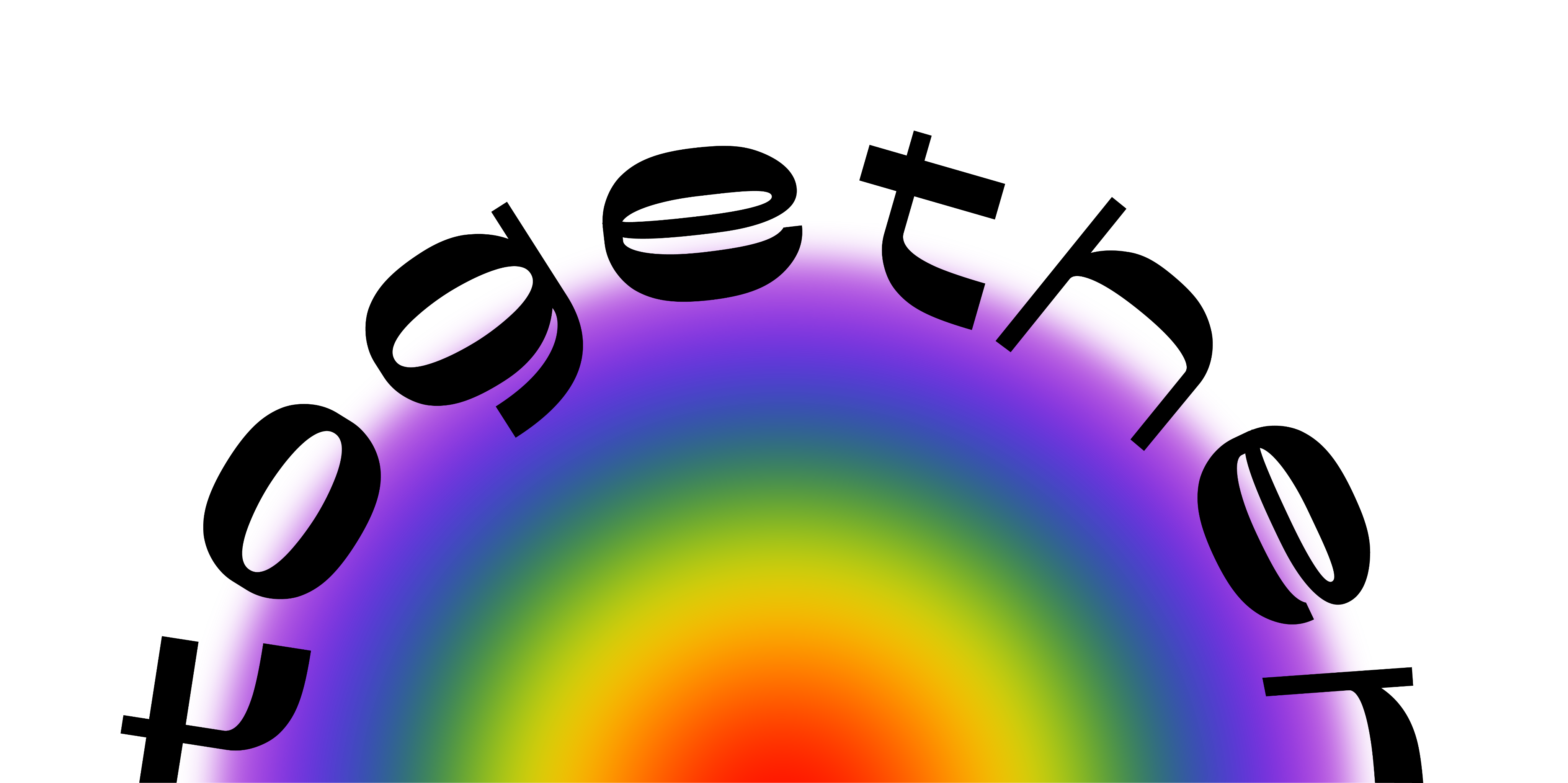
As allies, we have to be careful that we do not take away any space from the community. As welcoming as Pride is, recognize that your role exists outside it. Your role lies in educating yourself, talking to your friends, teachers, and colleagues, and standing alongside your friends from the community — excerpt from the blog.
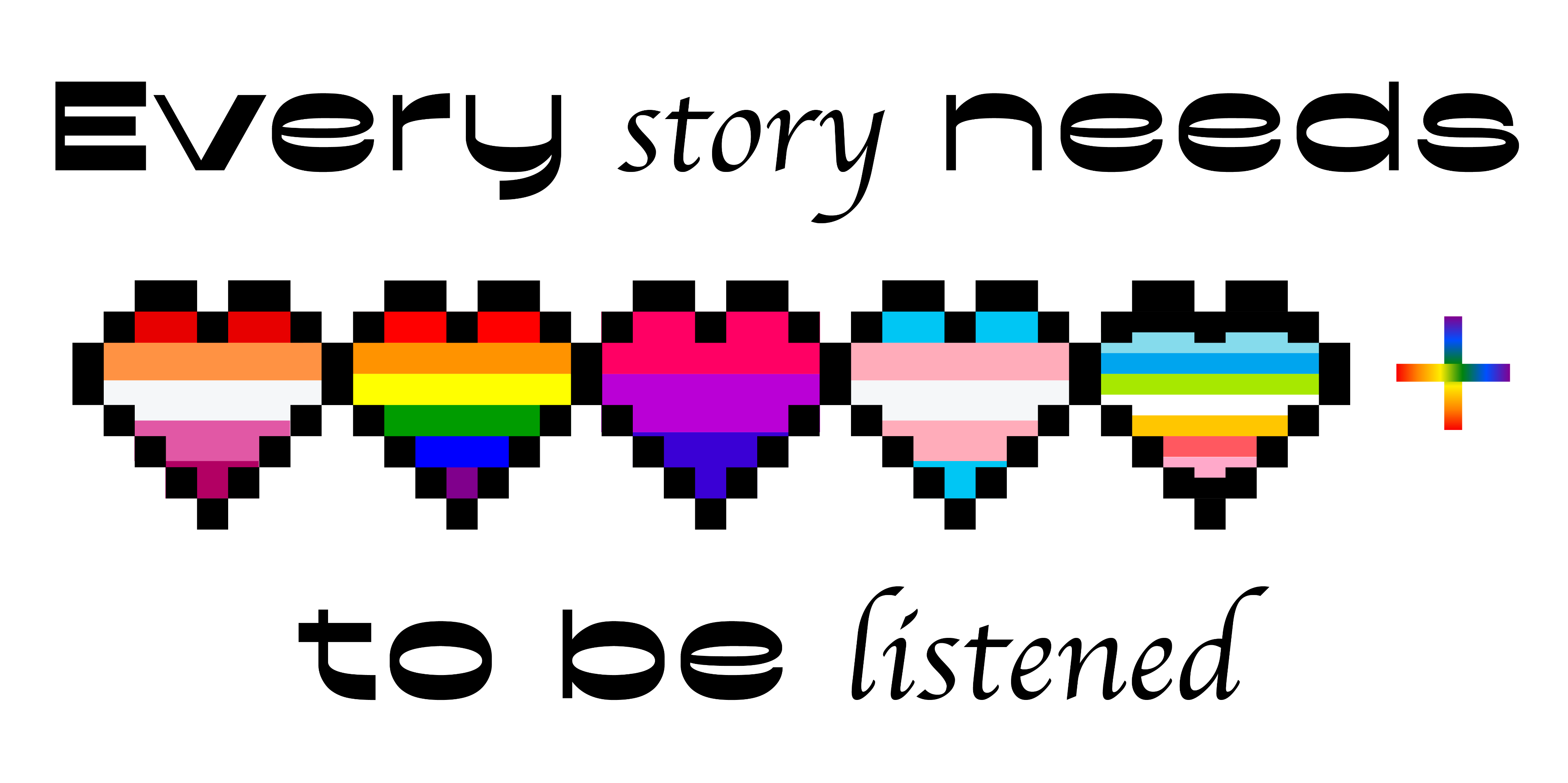
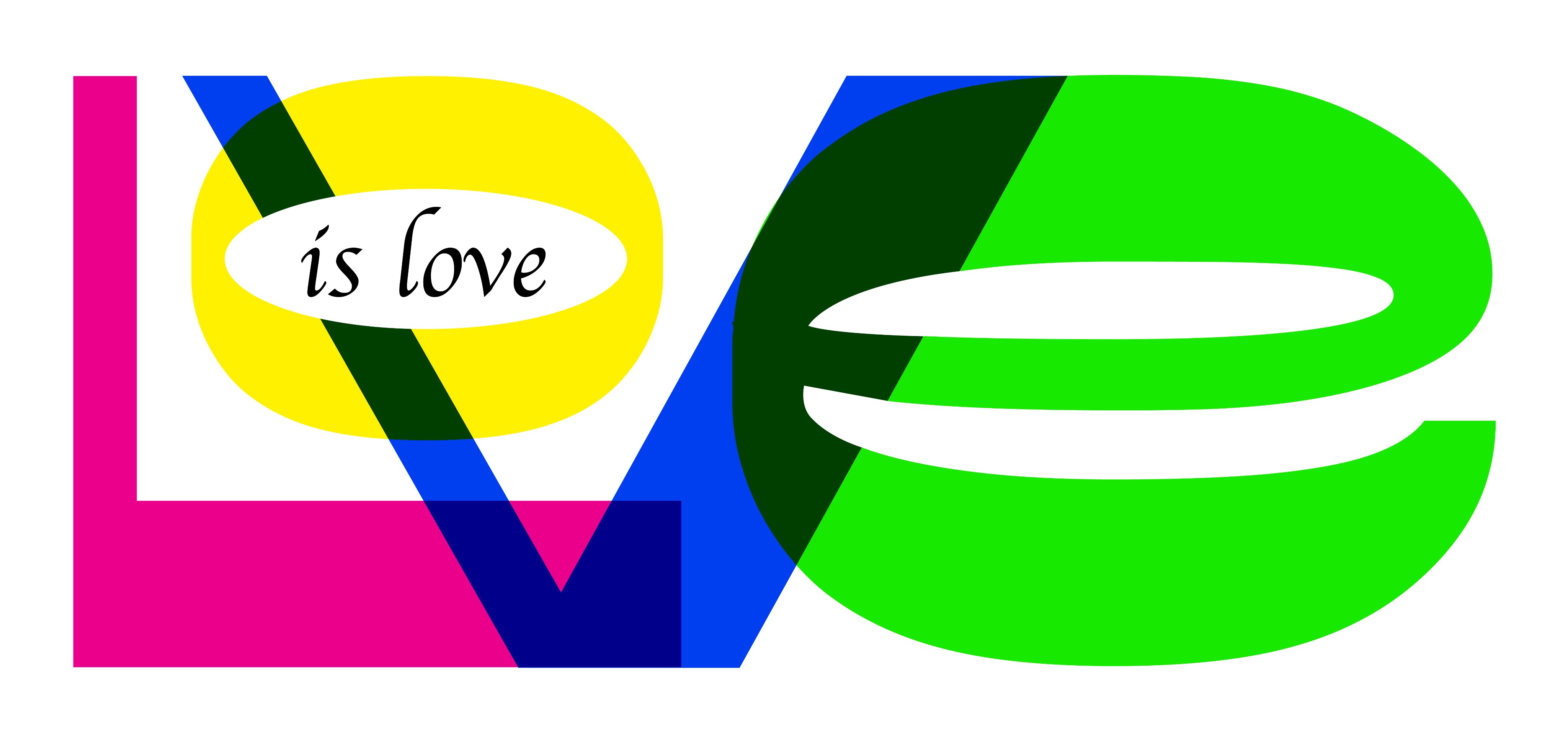
Depicting one of the most celebrated quotes ‘Love is love’ through typography.
Content: Diya Ghosh
Design: Jayshree Ramgarhia
Supervision: Himanshu Khanna (design), Sakshi Chowdhry (content)